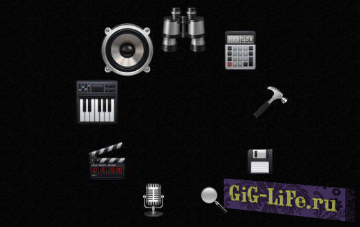

Отличное и очень редкое круглое меню, в котором при наведение мышку плавно увеличивается в размерах. Скажу сразу, что под такое меню Вам придётся подстраивать дизайн у всего сайта, так как меню является уникальным и необычной формы. Чем то форма этого меню напоминает менюшку у мобильных телефонов. Все картинки в этом круглом меню имеют размер 80 на 80 пикселей, и при желании их можно заменить на свои и на под тематику Вашего сайта. Ссылки в коде меню нужно изменить на свои. Если же у Вас остались какие-то вопросы, тогда задавайте их в комментариях чуть ниже.
<style>
.circles {width:320px; height:320px; border-radius:320px; margin:50px auto; position:relative; border-radius:320px;}
.circles a.tgt {display:block; position:absolute; left:128px; top:0; width:64px; height:64px; border-radius:64px; z-index:100;
-webkit-transform-origin:32px 160px;
-moz-transform-origin:32px 160px;
-ms-transform-origin:32px 160px;
-o-transform-origin:32px 160px;
transform-origin:32px 160px;
}
.circle li:nth-child(2),
.circles a:nth-child(2) {
-webkit-transform: rotate(40deg);
-moz-transform: rotate(40deg);
-ms-transform: rotate(40deg);
-o-transform: rotate(40deg);
transform: rotate(40deg);
}
.circle li:nth-child(3),
.circles a:nth-child(3) {
-webkit-transform: rotate(80deg);
-moz-transform: rotate(80deg);
-ms-transform: rotate(80deg);
-o-transform: rotate(80deg);
transform: rotate(80deg);
}.circle li:nth-child(4),
.circles a:nth-child(4) {
-webkit-transform: rotate(120deg);
-moz-transform: rotate(120deg);
-ms-transform: rotate(120deg);
-o-transform: rotate(120deg);
transform: rotate(120deg);
}
.circle li:nth-child(5),
.circles a:nth-child(5) {
-webkit-transform: rotate(160deg);
-moz-transform: rotate(160deg);
-ms-transform: rotate(160deg);
-o-transform: rotate(160deg);
transform: rotate(160deg);
}
.circle li:nth-child(6),
.circles a:nth-child(6) {
-webkit-transform: rotate(200deg);
-moz-transform: rotate(200deg);
-ms-transform: rotate(200deg);
-o-transform: rotate(200deg);
transform: rotate(200deg);
}
.circle li:nth-child(7),
.circles a:nth-child(7) {
-webkit-transform: rotate(240deg);
-moz-transform: rotate(240deg);
-ms-transform: rotate(240deg);
-o-transform: rotate(240deg);
transform: rotate(240deg);
}
.circle li:nth-child(8),
.circles a:nth-child(8) {
-webkit-transform: rotate(280deg);
-moz-transform: rotate(280deg);
-ms-transform: rotate(280deg);
-o-transform: rotate(280deg);
transform: rotate(280deg);
}
.circle li:nth-child(9),
.circles a:nth-child(9) {
-webkit-transform: rotate(320deg);
-moz-transform: rotate(320deg);
-ms-transform: rotate(320deg);
-o-transform: rotate(320deg);
transform: rotate(320deg);
}
ul.circle {padding:0; margin:0; list-style:none; width:320px; height:320px; position:absolute; left:0; top:0; z-index:10;}
ul.circle li {position:absolute; left:128px; top:0; width:64px; height:64px; border-radius:64px;
-webkit-transform-origin:32px 160px;
-moz-transform-origin:32px 160px;
-ms-transform-origin:32px 160px;
-o-transform-origin:32px 160px;
transform-origin:32px 160px;
}
ul.circle li b {display:block; width:64px; height:64px; border-radius:64px; text-align:center; margin:0; position:relative;
-webkit-transition: 0.5s;
-moz-transition: 0.5s;
-ms-transition: 0.5s;
-o-transition: 0.5s;
transition: 0.5s;
}
ul.circle li b img {width:62.5%; height:62.5%; padding-top:18.75%;
-webkit-transition: 0.5s;
-moz-transition: 2s;
-ms-transition: 0.5s;
-o-transition: 0.5s;
transition: 0.5s;
}
.circle li:nth-child(2) b {
-webkit-transform: rotate(-40deg);
-moz-transform: rotate(-40deg);
-ms-transform: rotate(-40deg);
-o-transform: rotate(-40deg);
transform: rotate(-40deg);
}
.circle li:nth-child(3) b {
-webkit-transform: rotate(-80deg);
-moz-transform: rotate(-80deg);
-ms-transform: rotate(-80deg);
-o-transform: rotate(-80deg);
transform: rotate(-80deg);
}
.circle li:nth-child(4) b {
-webkit-transform: rotate(-120deg);
-moz-transform: rotate(-120deg);
-ms-transform: rotate(-120deg);
-o-transform: rotate(-120deg);
transform: rotate(-120deg);
}
.circle li:nth-child(5) b {
-webkit-transform: rotate(-160deg);
-moz-transform: rotate(-160deg);
-ms-transform: rotate(-160deg);
-o-transform: rotate(-160deg);
transform: rotate(-160deg);
}
.circle li:nth-child(6) b {
-webkit-transform: rotate(-200deg);
-moz-transform: rotate(-200deg);
-ms-transform: rotate(-200deg);
-o-transform: rotate(-200deg);
transform: rotate(-200deg);
}
.circle li:nth-child(7) b {
-webkit-transform: rotate(-240deg);
-moz-transform: rotate(-240deg);
-ms-transform: rotate(-240deg);
-o-transform: rotate(-240deg);
transform: rotate(-240deg);
}
.circle li:nth-child(8) b {
-webkit-transform: rotate(-280deg);
-moz-transform: rotate(-280deg);
-ms-transform: rotate(-280deg);
-o-transform: rotate(-280deg);
transform: rotate(-280deg);
}
.circle li:nth-child(9) b {
-webkit-transform: rotate(-320deg);
-moz-transform: rotate(-320deg);
-ms-transform: rotate(-320deg);
-o-transform: rotate(-320deg);
transform: rotate(-320deg);
}
.circles a.tgt:hover {display:block; position:absolute; left:96px; top:-32px; width:128px; height:128px; border-radius:128px; z-index:100; z-index:50;
-webkit-transform-origin:64px 192px;
-moz-transform-origin:64px 192px;
-ms-transform-origin:64px 192px;
-o-transform-origin:64px 192px;
transform-origin:64px 192px;
}
.circles a.p1:hover ~ .circle li:nth-child(1) b,
.circles a.p2:hover ~ .circle li:nth-child(2) b,
.circles a.p3:hover ~ .circle li:nth-child(3) b,
.circles a.p4:hover ~ .circle li:nth-child(4) b,
.circles a.p5:hover ~ .circle li:nth-child(5) b,
.circles a.p6:hover ~ .circle li:nth-child(6) b,
.circles a.p7:hover ~ .circle li:nth-child(7) b,
.circles a.p8:hover ~ .circle li:nth-child(8) b,
.circles a.p9:hover ~ .circle li:nth-child(9) b
{width:128px; height:128px; border-radius:128px; margin-left:-32px; margin-top:-32px;}
.circles a.p1:hover ~ .circle li:nth-child(2) b,
.circles a.p2:hover ~ .circle li:nth-child(3) b,
.circles a.p3:hover ~ .circle li:nth-child(4) b,
.circles a.p4:hover ~ .circle li:nth-child(5) b,
.circles a.p5:hover ~ .circle li:nth-child(6) b,
.circles a.p6:hover ~ .circle li:nth-child(7) b,
.circles a.p7:hover ~ .circle li:nth-child(8) b,
.circles a.p8:hover ~ .circle li:nth-child(9) b,
.circles a.p9:hover ~ .circle li:nth-child(1) b
{width:112px; height:112px; border-radius:112px; margin-left:-24px; margin-top:-24px;}
.circles a.p1:hover ~ .circle li:nth-child(3) b,
.circles a.p2:hover ~ .circle li:nth-child(4) b,
.circles a.p3:hover ~ .circle li:nth-child(5) b,
.circles a.p4:hover ~ .circle li:nth-child(6) b,
.circles a.p5:hover ~ .circle li:nth-child(7) b,
.circles a.p6:hover ~ .circle li:nth-child(8) b,
.circles a.p7:hover ~ .circle li:nth-child(9) b,
.circles a.p8:hover ~ .circle li:nth-child(1) b,
.circles a.p9:hover ~ .circle li:nth-child(2) b
{width:96px; height:96px; border-radius:96px; margin-left:-16px; margin-top:-16px;}
.circles a.p1:hover ~ .circle li:nth-child(4) b,
.circles a.p2:hover ~ .circle li:nth-child(5) b,
.circles a.p3:hover ~ .circle li:nth-child(6) b,
.circles a.p4:hover ~ .circle li:nth-child(7) b,
.circles a.p5:hover ~ .circle li:nth-child(8) b,
.circles a.p6:hover ~ .circle li:nth-child(9) b,
.circles a.p7:hover ~ .circle li:nth-child(1) b,
.circles a.p8:hover ~ .circle li:nth-child(2) b,
.circles a.p9:hover ~ .circle li:nth-child(3) b
{width:80px; height:80px; border-radius:80px; margin-left:-8px; margin-top:-8px;}
.circles a.p1:hover ~ .circle li:nth-child(9) b,
.circles a.p2:hover ~ .circle li:nth-child(1) b,
.circles a.p3:hover ~ .circle li:nth-child(2) b,
.circles a.p4:hover ~ .circle li:nth-child(3) b,
.circles a.p5:hover ~ .circle li:nth-child(4) b,
.circles a.p6:hover ~ .circle li:nth-child(5) b,
.circles a.p7:hover ~ .circle li:nth-child(6) b,
.circles a.p8:hover ~ .circle li:nth-child(7) b,
.circles a.p9:hover ~ .circle li:nth-child(8) b
{width:112px; height:112px; border-radius:112px; margin-left:-24px; margin-top:-24px;}
.circles a.p1:hover ~ .circle li:nth-child(8) b,
.circles a.p2:hover ~ .circle li:nth-child(9) b,
.circles a.p3:hover ~ .circle li:nth-child(1) b,
.circles a.p4:hover ~ .circle li:nth-child(2) b,
.circles a.p5:hover ~ .circle li:nth-child(3) b,
.circles a.p6:hover ~ .circle li:nth-child(4) b,
.circles a.p7:hover ~ .circle li:nth-child(5) b,
.circles a.p8:hover ~ .circle li:nth-child(6) b,
.circles a.p9:hover ~ .circle li:nth-child(7) b
{width:96px; height:96px; border-radius:96px; margin-left:-16px; margin-top:-16px;}
.circles a.p1:hover ~ .circle li:nth-child(7) b,
.circles a.p2:hover ~ .circle li:nth-child(8) b,
.circles a.p3:hover ~ .circle li:nth-child(9) b,
.circles a.p4:hover ~ .circle li:nth-child(1) b,
.circles a.p5:hover ~ .circle li:nth-child(2) b,
.circles a.p6:hover ~ .circle li:nth-child(3) b,
.circles a.p7:hover ~ .circle li:nth-child(4) b,
.circles a.p8:hover ~ .circle li:nth-child(5) b,
.circles a.p9:hover ~ .circle li:nth-child(6) b
{width:80px; height:80px; border-radius:80px; margin-left:-8px; margin-top:-8px;}
</style>
<div class="circles">
<a class="tgt p1" href="#"></a>
<a class="tgt p2" href="#"></a>
<a class="tgt p3" href="#"></a>
<a class="tgt p4" href="#"></a>
<a class="tgt p5" href="#"></a>
<a class="tgt p6" href="https://img.excelkin.online/"></a>
<a class="tgt p7" href="#"></a>
<a class="tgt p8" href="#"></a>
<a class="tgt p9" href="#"></a>
<ul class="circle">
<li><b><img src="/s/web/uCoz/1/i1.png" alt="" /></b></li>
<li><b><img src="/s/web/uCoz/1/i2.png" alt="" /></b></li>
<li><b><img src="/s/web/uCoz/1/i3.png" alt="" /></b></li>
<li><b><img src="/s/web/uCoz/1/i4.png" alt="" /></b></li>
<li><b><img src="/s/web/uCoz/1/i5.png" alt="" /></b></li>
<li><b><img src="/s/web/uCoz/1/i6.png" alt="" /></b></li>
<li><b><img src="/s/web/uCoz/1/i7.png" alt="" /></b></li>
<li><b><img src="/s/web/uCoz/1/i8.png" alt="" /></b></li>
<li><b><img src="/s/web/uCoz/1/i9.png" alt="" /></b></li>
</ul>
</div>
Раздел: Универсальные скрипты
Категория:
Меню
Кодировка: utf-8
Автор:
Неизвестен
Опубликовал: Дмитрий